A tabbed interface, or simply a tab, is a graphical control element that allows the user to access several panels or documents within a single window. As a result, it is ideal for single-page websites and applications. It not only provides consumers with a clean and structured user interface, but also significantly simplifies the navigating process. Therefore, if you operate a text-heavy website or just a website with a lot of material, CSS tabs are the simplest approach to increase user engagement.
Keeping this in mind, we’ve compiled a list of the top alternatives available to our customers today. Hand-picked and organised according to the greatest design aspects and trends, we hope this list assists you in getting the ideal start. We’ve given options for anything from animated to basic, complicated to minimal.
Vertical Tabs Using HTML, CSS & JavaScript

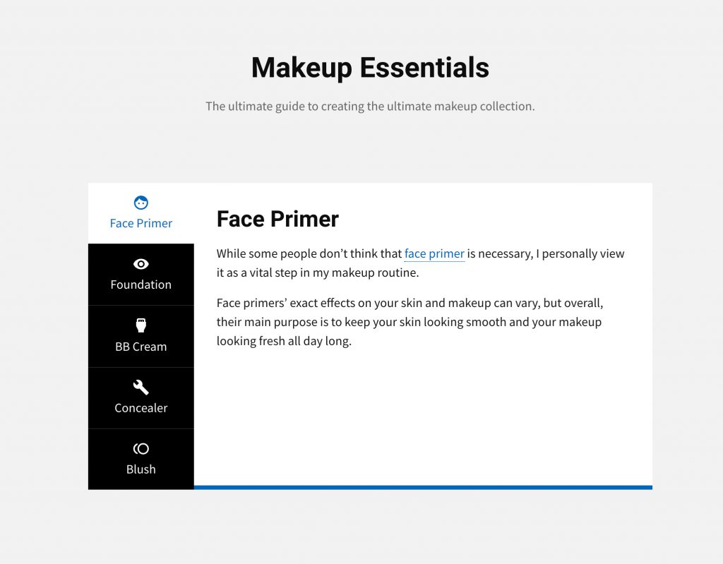
Vertical Tabs are very useful to present the various content easily. These Tabs are perfect for single page web applications. These vertical tabs are created using HTML, CSS and jQuery. Interface of these tabs is enhanced by using Google Material Icons and cool animation. These are responsive web page tabs. These simple css tabs will look good on all displays and style of interface can easily be changed via CSS.
NAV TAB

Additionally, the contentbox serves as a placeholder for an image or title, as well as links. When hovered over, the seamless transition is seen, along with the animated button that takes you to the full view of the information. This style is ideal for making navigating easy for users. Additionally, you may use this to classify text-heavy websites like blogs. Additionally, the colour scheme of black, pink, and white is quite adaptable and versatile.
CSS TAB

This basic, minimal pure CSS tab design, resembling a folder organisation, is the next in line for you. Based solely on CSS and HTML for the general structure and animations, we can conclude that it is fairly simple to comprehend and duplicate. The tabs are meant to resemble folder tabs, and like any folder, the contents are switched according to the tab selected. Additionally, you’ll notice a basic hover effect over the tab’s numeric icons. It appears to be responsive as well, which indicates that the design adapts easily to all device frames.
TABS WIDGET. NO JS!

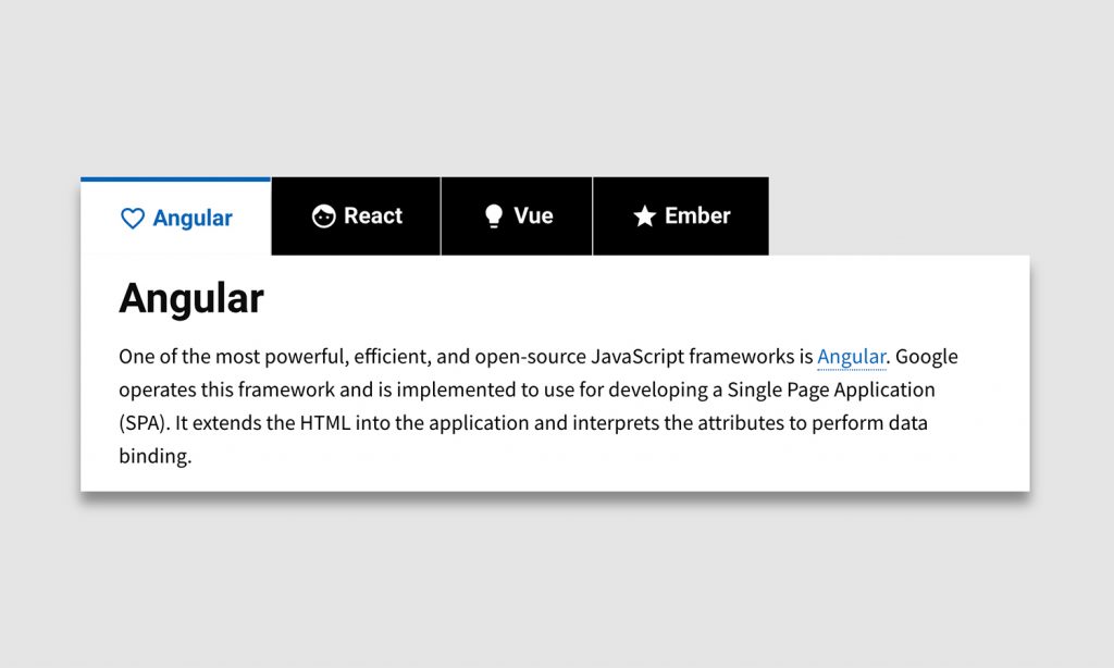
This is a fairly basic design that exemplifies the correct use of CSS tabs. It has a somewhat purpose-driven interface that encompasses everything one would expect from a tab design. It has a straightforward design, with the contents shown beneath the functional tab navigation. Additionally, the colour pallet is quite appealing. When a certain tab is clicked, the information therein fade in and out of view using CSS and JS instructions. This template is fully configurable, which means that users may alter any of the aspects to their liking. Overall, a rather unique and straightforward method of incorporating tabs or menus into your website; the URL below offers complete access to the code structures and live samples.
TABS

Finally, but certainly not least, here is another in the blue and white CSS tab design. This design, which is entirely composed of CSS and HTML, is also totally responsive. It changes into either a horizontal or vertical view of the tabs depending on the screen size. The hover effect is also pretty amazing when adjusting the opacity of each tab. Another enticing animation is utilised on the content area, which compresses and grows as the user navigates between sections. Pale blue and white also work well together, lending an air of serenity and cleanliness to the piece. Additionally, because it is built on CSS and HTML, incorporating this style into your site is simplified.
Pure HTML CSS Tabs

HTML tabs are perfect for web applications. Different subjects can easily be displayed with tabs ui design. You will love these simple and well designed tabs. Tabs layout is enhanced with Google material icons. These are CSS only tabs and are compatible with modern browsers. Pure HTML CSS tabs are responsive. You will observe a behaviour of accordion tabs on small displays.
PURE CSS TAB MODULE

If you’re searching for something a little more complex and unusual, this vertical CSS tab design is for you. Created with a coding framework that incorporates CSS, HTML, and JS, this entire design is unique and visually appealing. It utilises a horizontal tab layout rather than the conventional vertical layout, with all tabs represented by icons. The contents are organised in a card-based layout, and each card fades in and out of view when the tabs are clicked. Another minor feature is the colour transition effect that occurs when the mouse is hovered over the tab icons.
SIMPLE PURE CSS TABS

In terms of radio buttons and their effect, this CSS tab design is fully based on the same style and pattern. Rather from the usual tabs represented by text or icons, radio buttons are used here. When any of the tabs is clicked, a dialogue window displays below allowing users to read the contents. As with a radio button, only one tab may be opened at a time and it collapses instantly when the next choice is selected. The colour palettes are kept quite basic, consisting primarily of purple and white. Additionally, for added creativity, the colour transition on the buttons when a certain tab is clicked is included.
PURE CSS TABS

Let’s begin with something basic, beautiful, and uncomplicated. This Pure CSS tab is aesthetically attractive and performs admirably while displaying numerous articles or contents in a single screen. Purple and white colour combinations are quite soothing to the eye. And achieving the outcome with only a simple HTML and CSS framework is remarkable. As with the most of the tab examples, this one also utilises a horizontal layout to highlight the toggle choice. The radio input is used to create a simple transition in the colour shading. This implies that a deeper shade of purple is utilised to indicate which part has been clicked. Although the creator of this design kept it basic, a link to the 3D version, which also utilises JS, is included below the sample.
CSS TABS

This is a more creative take on a CSS tab since it includes animation, effects, and an original design structure. While the majority of tabs are intended as a straightforward navigation feature, this one is more focused on creating an interesting and engaging aspect for your users to enjoy. Rather than using standard typefaces or text on the tabs, the designer chose to utilise flat icons. Each of them is also intended to perform an eye-catching hover and click effect when the highlight is moved to the selected tab. The zoom in and out effect is also used to bring the contents into and out of view.
PURE CSS TABS WITH INDICATOR

As the name implies, this Pure CSS Tabs with indication is entirely composed of HTML and CSS. It comprises a card with a material design that serves as the tab’s foundation. Each tab is also represented with a unique icon in addition to the title. While the design is simple, the animations are pretty amazing. The designer achieved a seamless movement of content with each click by utilising basic CSS. When a tab is chosen, its title changes colour and becomes underlined to emphasise the selection. The entire code structure is available for viewing by following the link below.
ANIMATED TRANSITION TABS

When it comes to the 3D effect and the more complex alternative, this animated CSS tabs is the ideal illustration. Although the animation is modest, the effect is rather stunning. And the greatest part is that everything is written in CSS and HTML. This facilitates the structure’s implementation and comprehension. The combination of green and white on a navy blue backdrop works extremely well. When a mouse is hovered over one of the tabs, it expands in a fluid animation and when clicked, the colour scheme changes to accentuate the selection.
PURE CSS COLOR TABS

The example above demonstrates two tabs with distinct contents that slide left and right into the device’s screen to quit or enter display. The tabs as a whole have a rather basic design. Additionally, it highlights the pick with a simple dynamic underlining underneath the headline. Of course, the advantage is that the entire structure is composed only of CSS and HTML codes, which is not as difficult or sophisticated as it may appear. Simply click the link below to see a complete list of all the items utilised and to experience the demo.
ONLY CSS TABS

Everything is well-designed, from the tab design to the content holders to the smooth and clean animations and transitions. And, despite the demo being a fake, it is ready to go Live with just a few minor adjustments. When hovered over, the tabs use CSS effects to highlight them, and when clicked, they fully change colour schemes. As seen above, virtually anything is feasible to include, including text, links, pictures, and even forms and call-to-action buttons. The finished effect is rather remarkable, and the greatest thing is that it is totally composed of CSS and HTML.
CSS3 TABS

The developer of this example achieved a fantastic end result by using a patterned backdrop and an interesting method for revealing the content on each page. To maintain a clean and professional appearance, it utilises a blue and white colour scheme. The tabs and texts are very straightforward, but what elevates this to a higher level are the effects on the tabbed box and the words. When a tab is clicked, the content box appears in an almost lifelike manner thanks to CSS3 animations. Another minor feature is the colour change from black to blue when the cursor is hovered over.
Conclusion
We have discussed about css tabs in this article. Because of clear and organized layout, it makes browsing across the site much easier. CSS tabs are the easiest way to enhance user engagement on a text-heavy website or a website with a lot of information.